In a previous post I described how to create a Github Repository browser app. The UI in that app was written using XML layouts(imperative UI). In the recent years developers have been finding it easier to define and update the views using the declarative UI paradigm. This leads to Google releasing Jetpack Compose 1.0 in July 2021.
In this post I will describe how to create a login view with Jetpack compose, while using the view models from an existing MVVM project.
Create a new Compose project
To get the existing view models, I clone the existing project and push it as a new project to Github.
Setup Compose dependencies
Compose requires considerable amount of dependencies and configuration.
android {
    kotlinOptions {
        jvmTarget = '1.8'
        useIR = true
    }
    buildFeatures {
        compose true
    }
    composeOptions {
        kotlinCompilerExtensionVersion rootProject.composeVersion
    }
}

dependencies {
    ...
    // Compose
    implementation "androidx.compose.runtime:runtime:$compose_version"
    implementation "androidx.compose.ui:ui:$compose_version"
    implementation "androidx.compose.foundation:foundation:$compose_version"
    implementation "androidx.compose.foundation:foundation-layout:$compose_version"
    implementation "androidx.compose.material:material:$compose_version"
    implementation "androidx.compose.runtime:runtime-livedata:$compose_version"
    implementation "androidx.compose.ui:ui-tooling:$compose_version"
    implementation "com.google.android.material:compose-theme-adapter:$compose_version"
    implementation 'androidx.activity:activity-compose:1.3.1'}
Remove Activity/Fragment layout files
Compose does not use XML layouts. Thus, the res/layout folder can be removed. All of the current Activity code can also be removed. Only onCreate() function will be retained to load the @Composable view.
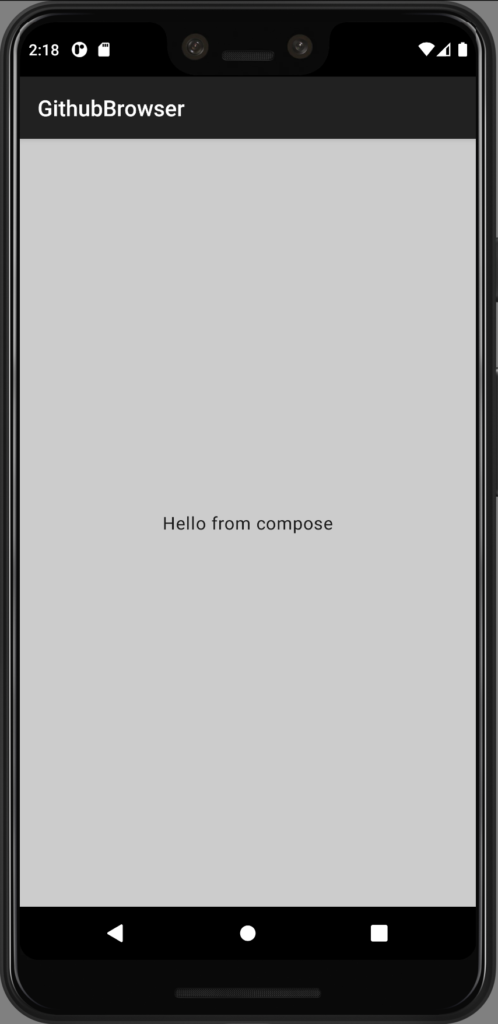
Load a @Composable view
In the Activity’s onCreate, there only needs to be a single call:
setContent {
    LoginView()
}
That sets the UI to the LoginView’s @Composable:
@Composable
fun LoginView() = AppTheme {
    Column(
        verticalArrangement = Arrangement.Center,
        horizontalAlignment = Alignment.CenterHorizontally,
        modifier = Modifier
            .background(Color.LightGray)
            .fillMaxSize()
    ) {
        Text("Hello from compose")
    }
}
There are more changes required to migrate from XML layouts to @Compose, like removing XML themes and colours. See the full list of changes in this commit.
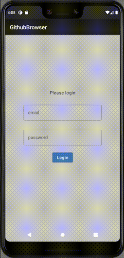
Create the login fields
For the Login, 3 components are required:
E-mail and password text fields can be represented with TextField or OutlinedTextField.
OutlinedTextField(
    value = email,
    placeholder = { Text(text = "user@email.com") },
    label = { Text(text = "email") },
    onValueChange = onEmailChange,
)

OutlinedTextField(
    value = password,
    placeholder = { Text(text = "password") },
    label = { Text(text = "password") },
    onValueChange = onPasswordChange,
)
The login button can be represented with Button
Button(onClick = {
    if (email.isBlank() == false && password.isBlank() == false) {
        onLoginClick(email)
        focusManager.clearFocus()
    } else {
        Toast.makeText(
            context,
            "Please enter email and password",
            Toast.LENGTH_SHORT
        ).show()
    }
}) {
    Text("Login")
}
Keep the child @Composable stateless
Login Fields will be added as a child to the main LoginView. The child @Composable state changes will be hoisted to the parent view. This way the child components can be reused tested separately.
@Composable
fun LoginView(viewModel: LoginViewModel) = AppTheme {
    var email by rememberSaveable { mutableStateOf("") }
    var password by rememberSaveable { mutableStateOf("") }

    Column(
        verticalArrangement = Arrangement.Center,
        horizontalAlignment = Alignment.CenterHorizontally,
        modifier = Modifier
            .background(Color.LightGray)
            .fillMaxSize()
    ) {
        LoginFields(
						// The fields are kept stateless and the state is hoisted to/from
						// the parent LoginView @Composable.
            email,
            password,
            onLoginClick = { viewModel.login(email, password) },
            onEmailChange = { email = it },
            onPasswordChange = { password = it }
        )
    }
}
Hide the keyboard on background press
The keyboard is expected to be hidden on a background press. For this, a .clickable{ } modifier can be added that clears the text field’s focus.
val focusManager = LocalFocusManager.current

Column(
    modifier = Modifier
        .fillMaxSize()
        .clickable { focusManager.clearFocus() }
) {
See the full login fields composable function here.
Animate the text fields up after focus
After selecting one of the text fields, the user expects the UI to slide up. To achieve this, there are different options. When using AppCompat, it can be enabled for a wider range of Android devices.
WindowCompat.setDecorFitsSystemWindows(window, false)
val rootView = findViewById<View>(android.R.id.content).rootView
ViewCompat.setOnApplyWindowInsetsListener(rootView) { _, insets ->
    val imeHeight = insets.getInsets(WindowInsetsCompat.Type.ime()).bottom
    rootView.setPadding(0, 0, 0, imeHeight)
    insets
}
Connect the view model
The view model from the XML layout project can be used without changes to its code. It can be injected via Koin’s(koin-android:3.0.2+) getViewModel()
override fun onCreate(savedInstanceState: Bundle?) {
    super.onCreate(savedInstanceState)

    setContent {
        LoginView(getViewModel())
    }
}
The developer needs to use observeAsState() on view model’s LiveData objects to make them update composed views.
val user by viewModel.user.observeAsState()
when (user?.status) {
    Status.LOADING -> {
			// draw compose views
Show progress indicator when loading
Use a CircularProgressIndicator to show progress while the web request is loading.
when (user?.status) {
	Status.LOADING -> {
	    CircularProgressIndicator(modifier = Modifier.size(width = 100.dp, height = 100.dp))
	}
	Status.SUCCESS -> {
		// other views
	}
	...
}
Show Snackbar with error when the request failed
User should be notified about the request error descriptions. Snackbar can be used for this functionality. It needs to be launched in a coroutineScope, because showSnackbar is a suspend function
Status.ERROR -> {
	coroutineScope.launch {
		val result = snackbarHostState.showSnackbar(
			"Login error: ${user?.errorMessage}")
Since the request error state is definite and doesn’t change, we need to manually set the ViewModel to its default state after dismiss button click
when (result) {
	SnackbarResult.ActionPerformed -> viewModel.goToInitialState()
}
See the full code here.
Success handling
In Jetpack Compose there only needs to be a single Activity. If the program receives the LiveData update with a logged in user, it can draw the @Composable with the main app view.
if (user?.data == null) {
    LoginFields(
        email,
        password,
        onLoginClick = { viewModel.login("ttiganik@gmail.com", password) },
        onEmailChange = { email = it },
        onPasswordChange = { password = it }
    )
} else {
		// We have a logged in user, show the main app view
    Text("Login successful")
    Text("User ${user?.data?.login}")
}
Final result
Conclusion
Declarative UI is a great evolution in the software development field. In a few years both of the major mobile platforms and cross-platform counterparts like Flutter have embraced it completely. It makes code easier to write, read and test. I recommend the reader to try and write a test app or refactor parts of a current app with Compose. Even if some concepts are hard to understand, it will be worthwhile in the end.
How to create a login screen with #JetpackCompose.https://t.co/l0l9l8DJKk #Kotlin #AndroidDev pic.twitter.com/oAXmbWZ4jS
— Tõnis Tiganik (@tonisives) September 28, 2021